This rack card was designed for the Annual Service Training Institute (ASTI). It was adapted from material created by Master Samurai Tech’s marketing consultants. The rack card, printed on thick paper stock, was designed to advertise MST’s online training. It primarily drew attention to the testimonial on the back and the special price on the full course bundle. A lot of information was packed into this design. Through the use of distinct text blocks and graphics, it was possible to communicate all we wished to say in the relatively limited space. The whole card is unified though strong branding that makes consistent use of MST colors, even down to the color of the text.
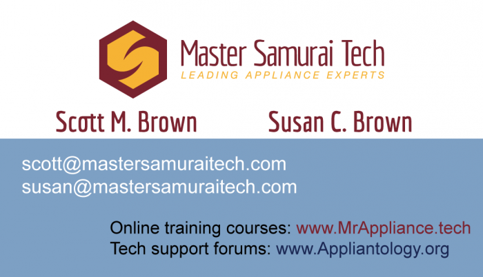
This is a business card for MST which was made to distribute at a trade show for our largest client, the Mr. Appliance franchise organization. The card was designed to promote our special online training Mr. Appliance techs. I designed the card to use our distinct look and colors—so it could easily be discerned among other promotional material. The use of two different colors is used to reinforce the two different websites we want people to visit on the back of the card.
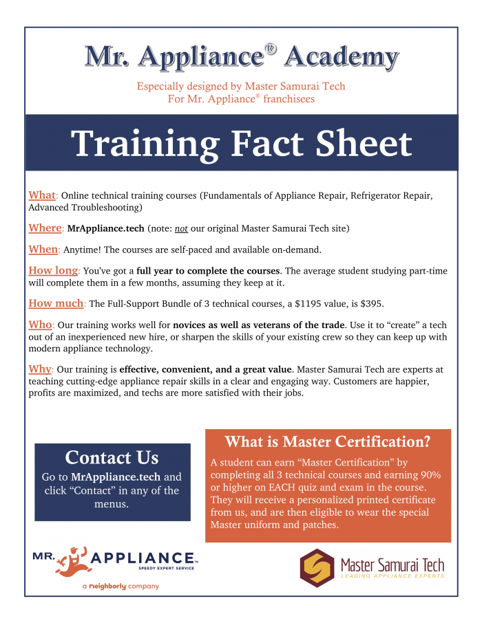
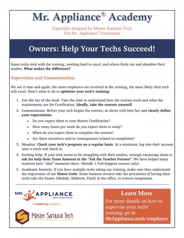
I designed this information handout for the Mr. Appliance convention. The document was made in Word. The maingoal was the presentation of information—mainly, what our company’s training can do for Mr. Appliance franchisees. I used Mr. Appliance’s brand colors instead of MST’s to make it immediately apparent to readers what this handout was about.
Coding Everywhere is a Python programming lecture series created by a fellow parishioner. He asked me to design alogo using the motif of a stork. I made the logo to be compact and versatile. The first font used is Courier, which is a com- monly used font in program editors. The second font is Century Gothic Regular. The two fonts contrast, Courier represent- ing traditional programming methods while the sleek, sans-serif Century Gothic evokes a modern, dynamic look.
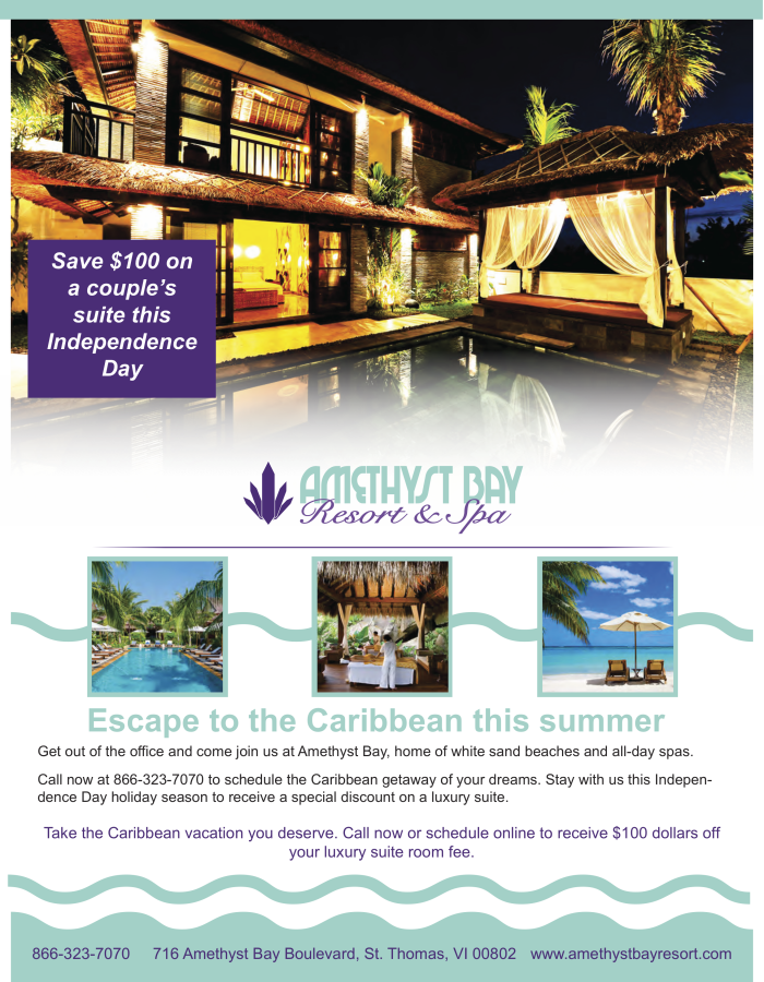
This is another school project. It is a magazine ad for a Caribbean resort. I was given pre-made branding material andthen told to design the ad. The market I was primarily targeting were couples. With this in mind I selected the images my- self. Because this is made for a magazine, the images are very prominent over the text.
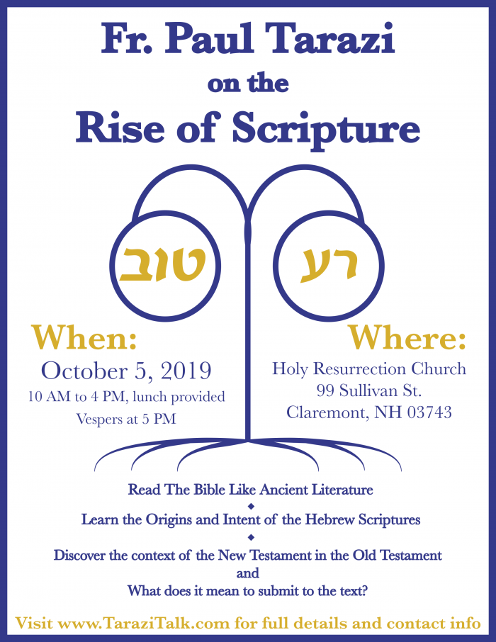
This is a poster I designed for the upcoming visit of Fr. Paul Tarazi to my parish. I wanted to make an eye-catching poster while also making the when and where of the event prominent, so people could see it in a glance. The centerpiece of the poster is a highly stylized tree bearing the Hebrew words for “good” and “evil”. The rich blue color was chosen because of the association of blue with the divine in Scripture and in iconography.
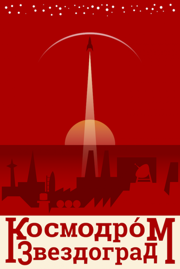
This final piece is a poster I designed and included in my final portfolio in college. Inspired by Art Deco, this poster is for the fictional Russian spaceport of Zvezdograd. The colors used were inspired from Soviet propaganda posters from WWII. My goal with this poster was purely artistic. The idea was to use empty negative space and bold text to give the sense of enormity. The small spaceship rises up through the empty space, giving the sense of ascension and heading into the unknown.